
Farsha
Journey through tradition with a contemporary flair
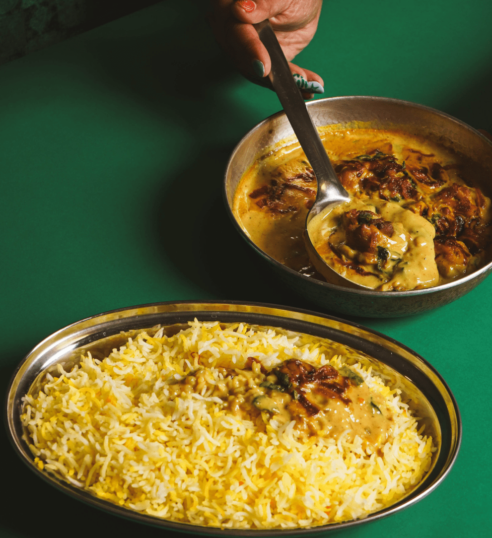
Farsha is a restaurant delivery brand with a clear mission: to bring the warmth and comfort of Omani home cooking to everyone in Muscat. Created by Chef Dina Macki, the menu is deeply inspired by her local Omani and Swahili heritage. Chef Dina has curated dishes that reflect what people eat in traditional Omani households while catering to modern Omanis and curious expats alike. Every dish on the menu is a blend of nostalgia and comfort, making Farsha more than just food delivery, it’s a taste of home and hospitality.
Read More
The name ‘Farsha,’ meaning a table spread or buffet enjoyed during family gatherings and celebrations, guided the narrative of the brand. At Studio Sein, we worked on building Farsha’s visual identity with a focus on storytelling, local heritage, and contemporary design. Our vision was to create a brand that feels welcoming, familiar, and vibrant. Just like sitting at a bustling Omani family table.
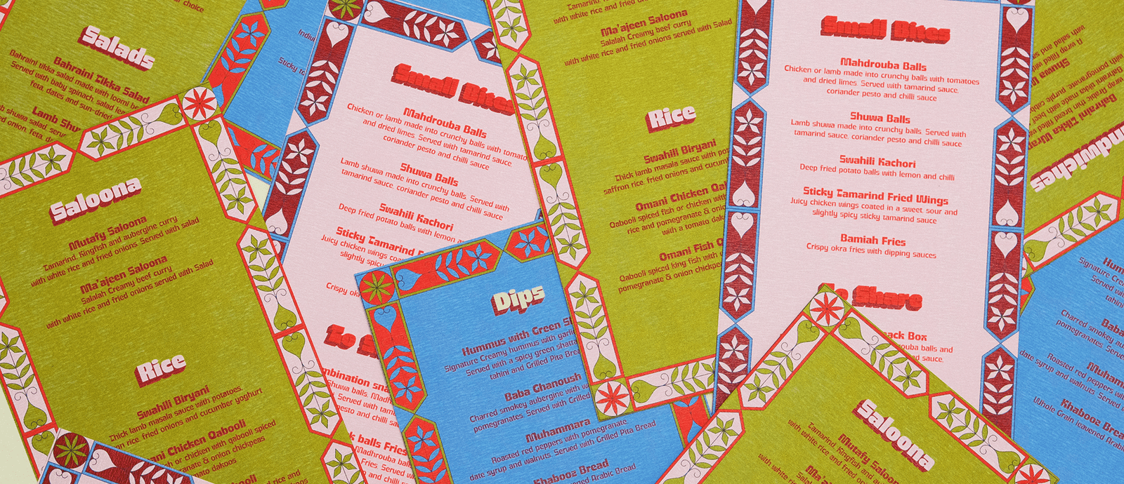
The foundation of Farsha’s visual language lies in the cultural significance of Omani hospitality. We drew inspiration from Omani doors, a long-standing symbol of warmth and generosity, where welcoming guests with food and drink is ingrained in local culture. Patterns from these traditional doors became an integral part of the brand identity, connecting the old with the new and embodying the experience Farsha delivers to its customers.
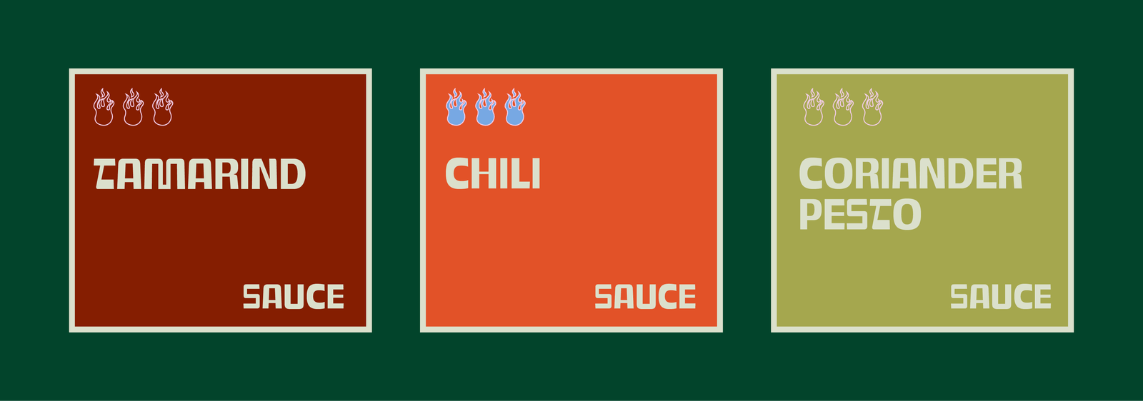
Color played a significant role in defining Farsha’s fresh, contemporary look. Inspired by the bright, vivid hues of spices and ingredients used in Omani cooking, the color palette lends the brand a youthful, energetic appeal while staying grounded in tradition. Since Farsha is a fast-food delivery service, these eye-catching colors also give the brand a strong presence on packaging, social media, and other touchpoints.
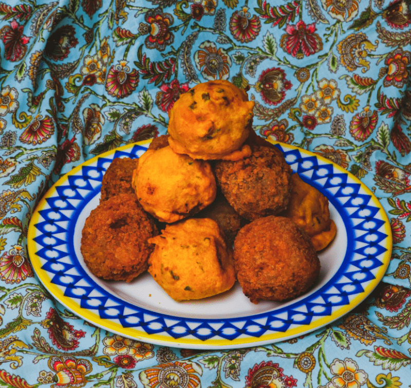
The patterns became a hallmark of Farsha’s visual identity. You see them everywhere, from product packaging to social media visuals. Some designs were directly inspired by recipes passed down to Chef Dina from the women in her family, showcasing the connection to legacy and tradition. Checkered patterns and fabric backdrops used in brand imagery evoke memories of eating in a grandmother’s kitchen—a place where love, food, and family come together effortlessly.
Scope of Work
Brand Strategy
Visual Identity
Creative Direction
Content Creation
Social Media Management
Packaging
Field
Food & Beverage
Culture
Project Year
2023
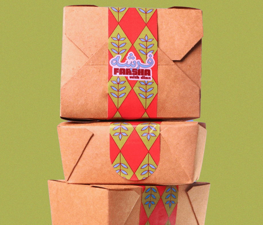
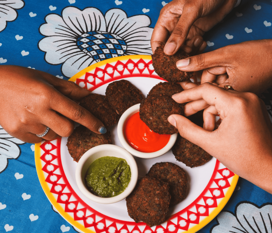
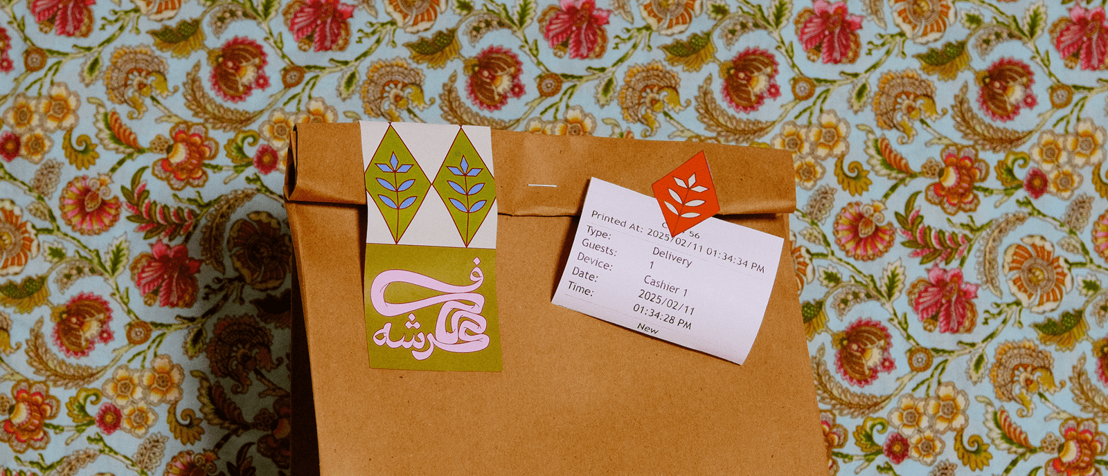
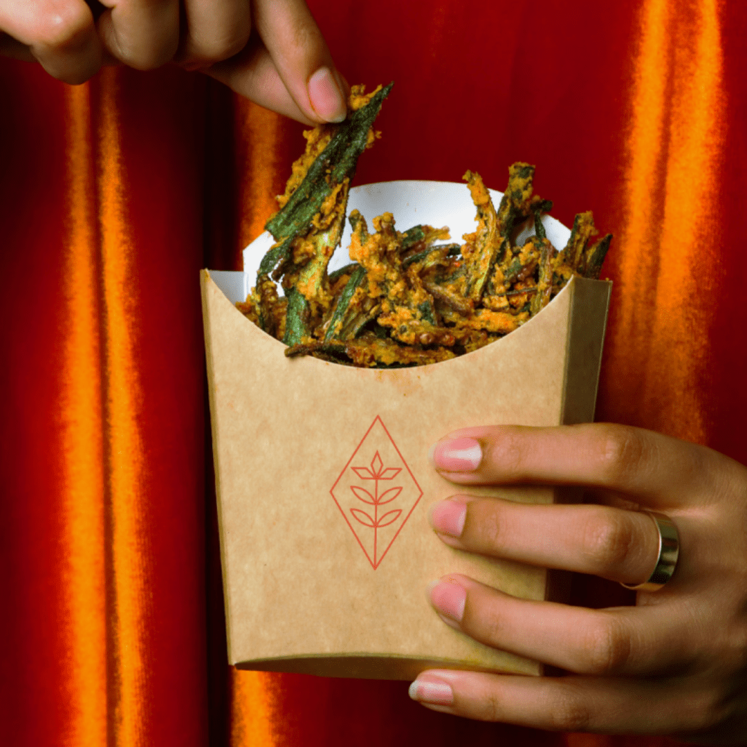

To emphasize Farsha’s young and playful character, we introduced motion graphics that mix tradition with modern design. This approach helped position Farsha as a brand that is contemporary, approachable, and full of personality.
The logo design was carefully crafted to tie into the essence of Omani and Zanzibari cuisine. Taking inspiration from the act of pulling dough, a fundamental technique in traditional dishes, the logo visually represents a key part of the food’s preparation and heritage while staying clean, modern, and versatile.
Farsha’s mission is to make Omani cuisine accessible to everyone. Whether it’s a family gathering, a meal for young couples, or an expat wanting to immerse themselves in local flavors.
With a vision to become the reliable go-to for traditional yet modern Omani dishes, Farsha is more than just a delivery service, it’s a piece of Omani culture, hospitality, and comfort delivered right to your door.
At Studio Sein, we are proud to have brought this vision to life through a bold, culturally-rooted, and fresh brand identity.

Graphic Design
Photography
Photography Asists
Samah Al Ansari
Thuraya Al Zubair
Hassan Haider
Eman Al Barwani
Graphic Design
Photography
Photography Asists
Samah Al Ansari
Thuraya Al Zubair
Hassan Haider
Eman Al Barwani
